




















In today’s digital-first world, the need for a website that works seamlessly across multiple devices and screen sizes is critical. Users access websites through an ever-expanding range of devices, including mobile phones, tablets, laptops, smart TVs, and even wearable technology such as smartwatches.
This diverse ecosystem means that businesses can no longer afford to have a website that works well only on a desktop or just one platform. Instead, websites need to be optimized for every possible screen and device to provide the best user experience (UX) and drive engagement.
At Opal Infotech, we specialize in multi-device website design solutions that ensure your website performs optimally across every device. Whether your audience accesses your site from smartphones, tablets, laptops, or desktops, we ensure that your website remains fast, responsive, and user-friendly.
In this article, we’ll explore the most critical web design strategies—such as responsive web design services, cross-platform web design, and mobile-first website design—to help you stay ahead in a rapidly changing digital landscape.
The Problem: Challenges of an Outdated Website in Today’s Multi-Device World
The digital world is evolving rapidly, and users are increasingly reliant on their smartphones and tablets to browse the web. According to recent statistics, more than 60% of global web traffic now comes from mobile devices. This shift makes it clear that a website’s success now hinges on its ability to provide an optimized, seamless experience on multiple devices.
Unfortunately, many websites still rely on outdated design structures that are not optimized for mobile or cross-device functionality. This results in numerous problems for businesses that fail to embrace multi-device and multi-screen optimization. Here are some of the most common issues caused by an outdated website:

Poor User Experience (UX) on Mobile Devices: Websites that are not responsive or mobile-optimized often have issues like small fonts, clunky navigation, slow loading times, and difficult-to-click buttons. This leads to a frustrating experience, which can increase bounce rates and lower conversion rates.

Inconsistent Display Across Devices: When a website isn’t designed with multi-device compatibility in mind, it may look great on a desktop but appear jumbled or distorted on a tablet or smartphone. This creates confusion for visitors, as the experience differs dramatically depending on the device they are using.

SEO Penalties: Google prioritizes mobile-first indexing, which means that a website’s mobile version is considered the primary version for ranking purposes. Websites that aren’t optimized for mobile may be penalized with lower rankings in search results, reducing visibility and traffic.

Slow Load Times: Websites that are not optimized for mobile devices often have heavy images, uncompressed code, and other inefficiencies that slow down loading times. Slow websites not only frustrate users but also result in lower search engine rankings.
In essence, a website that is not built with the future of responsive design in mind is likely to alienate users, hurt your SEO service performance, and fail to drive conversions.
The Solution: Embrace Cutting-Edge Multi-Device Web Design Technologies
To address these challenges and future-proof your online presence, Opal Infotech offers comprehensive solutions for multi-device website design. Through responsive web design, mobile-first design strategies, and cross-platform optimization, we ensure your website functions flawlessly, no matter the device. Below, we’ll dive into some of the most important strategies and technologies that make this possible.
Multi-Device Website Design for Seamless Experience
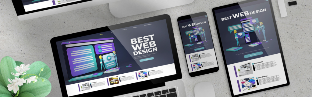
A multi-device website design focuses on providing a uniform, seamless experience across all platforms—smartphones, tablets, desktops, and even emerging technologies like smart TVs. With responsive design, your website will automatically adapt its layout, images, and content based on the size and resolution of the user’s screen.
At Opal Infotech, we follow a mobile-first approach in all of our designs, meaning we start by designing for mobile devices first before scaling up for larger screens. This approach ensures that your website is optimized for mobile users while still providing a great experience for desktop users.
Incorporating fluid grids and media queries into your design ensures that your website’s layout adjusts smoothly to varying screen sizes. Whether your users are on a 4-inch smartphone or a 27-inch desktop monitor, they will get an optimized experience tailored to their device.

Let’s Chat

Responsive Web Design Latest Trends for Beyond
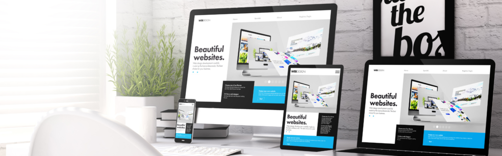
The future of responsive web design is focused on more than just resizing elements for different screen sizes. In 2025, responsive web design trends will evolve to include:
- Fluid Grids and Flexbox: These CSS techniques allow web elements to resize fluidly according to screen size. Flexbox and CSS Grid provide designers with more control over the layout structure, enabling them to design highly adaptive, responsive websites that adjust beautifully to any screen.
- Viewport Units: This new technique helps developers scale content proportionally depending on the device’s screen size, ensuring that your website’s images and typography always appear crisp and appropriately sized.
- Mobile-First Design with Progressive Enhancements: Mobile-first design continues to gain momentum, especially as more users access the web via smartphones. By prioritizing mobile design and progressively enhancing the experience for larger screens, you can ensure that your website is optimized for a broader audience.
Opal Infotech stays ahead of these trends by continuously updating our design techniques to reflect the latest responsive design principles. We ensure that your website is not just “mobile-friendly” but is built for the future of responsive web design.
Cross-Platform Web Design: Your Website on Every Device

A cross-platform website design ensures that your website performs consistently and efficiently on all devices, operating systems, and browsers. Whether your users access your website via iOS, Android, macOS, or Windows, cross-platform optimization guarantees they will enjoy a high-quality experience.
With our cross-platform web design expertise, we ensure that your website works flawlessly on various devices, browsers, and operating systems. Whether you’re targeting desktop users or smartphone and tablet users, we provide a consistent experience.
We focus on optimizing your website for both React native mobile apps and progressive web apps (PWAs). PWAs allow users to access your website like a native mobile app, without the need for an app download. This is an excellent option for businesses looking to bridge the gap between a website and a mobile application.
Mobile-First Website Design: Setting the Foundation for User-Centric Design

A mobile-first website design is no longer just a trend; it’s a requirement for modern web development. With mobile traffic dominating web usage, designing for mobile devices first ensures that websites are optimized for the smaller screens and touch interactions that are common on smartphones and tablets. At Opal Infotech, we approach website redesigns with mobile-first principles, ensuring that the most essential features of your website are designed for mobile before expanding to larger screens.
A mobile-first design focuses on core content and user actions that are most critical to a mobile user. This is often done by simplifying the layout, improving load times, and making navigation more intuitive for users on small screens. Once the mobile version of the website is optimized, the design is then scaled up for larger devices like tablets and desktops, ensuring that the transition from mobile to desktop remains smooth and intuitive.
Multi-Screen Website Design: Creating a Consistent Brand Experience
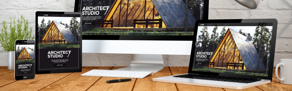
A multi-screen website design is a strategy used to ensure your website looks and functions seamlessly across various screen sizes. This approach takes into account the fact that users now interact with content across a wide array of devices and screen dimensions—from smartphones and tablets to widescreen monitors and TVs.
The goal of multi-screen website design is to offer a consistent brand experience no matter the screen size. This requires understanding how your users engage with your content across different devices. For instance, mobile users may engage with a website while on the go, requiring simple, quick interactions, while desktop users may spend more time exploring content and making purchasing decisions.
At Opal Infotech, we understand the intricacies of designing for multi-screen displays and ensuring that your website maintains visual consistency, regardless of the device. Our multi-screen strategy includes optimized images, flexible layouts, and scalable content that adjust fluidly to the screen size and resolution.
Cross-Device Optimization: Catering to an Expanding Digital Landscape

In addition to making sure your website works well across various screen sizes, it’s crucial to consider the diversity of operating systems and browsers used by your audience. Optimizing a website for cross-device usage involves not just ensuring the layout adjusts across screen sizes, but also that the site functions flawlessly across various platforms.
Whether users are visiting your website via iOS, Android, Windows, or macOS, we ensure cross-device compatibility by using advanced web technologies like HTML5, CSS3, and JavaScript frameworks. Our development team also tests every website on multiple devices and browsers to ensure a consistent experience.
At Opal Infotech, we specialize in cross-device website optimization, ensuring that your site works as intended whether it’s viewed on Safari on an iPhone, Chrome on an Android tablet, or Edge on a Windows desktop. Cross-device optimization eliminates technical barriers and provides a better user experience across the board.
Real Feedback, Real Results
“Excellent One Stop Web Solutions with all services under one roof. Apart from being Google Partners, Opal Infotech provides all basic and advance services like SEO based Website design, Mobile app development & Digital/SM Marketting as well. The Services are prompt & Value for money, additionally the Staff is understanding, cooperative and patient enough to give you round the clock support. All and all the First Choice for people who are trying to develop their system by themselves, do what you do best, leave the rest on Opal Infotech.”
– NLP Ashish Nagar – India


Why Choose Opal Infotech for Your Website Redesign?
As a leader in multi-device website design, Opal Infotech specializes in redesigning websites that are optimized for all screen sizes and devices. Whether you’re using platforms like WordPress, Angular, Drupal, Wix, Shopify, WooCommerce, Prestashop, Laravel, or BigCommerce, we have the expertise to transform your website into a fully optimized, responsive, and cross-platform app development solution.
Our adaptive web design practices ensure that your website not only looks great but also delivers a seamless user experience across diverse screen sizes. We understand the nuances of UI/UX design trends, multi-screen user interfaces, and website optimization for mobile devices.
We take pride in offering customized design solutions that deliver a seamless multi-device experience—a crucial factor in engaging users, improving SEO rankings, and maximizing conversions.
Optimizing User Experience for Multi-Screen and Multi-Device Engagement

As digital devices continue to evolve, so too does the importance of optimizing the user experience (UX) across a broad range of platforms. Users are no longer limited to accessing websites only from their desktop computers. Today, they interact with websites on smartphones, tablets, smartwatches, and a variety of other devices. Therefore, creating a consistent, seamless experience across all these devices has become paramount.
Leveraging Progressive Web Apps (PWAs) for Enhanced Mobile Experiences
The rise of Progressive Web Apps (PWAs) has dramatically changed the way businesses engage with their audiences on mobile devices. A PWA is a type of application software that behaves like a native mobile app but is accessed via the web. PWAs offer the best of both worlds—they provide a mobile app-like experience without the need for users to download anything from an app store.
PWAs offer several key benefits for businesses:
Offline Access: PWAs allow users to continue using your website or app even without an active internet connection, offering a seamless experience regardless of network conditions.
Push Notifications: PWAs can send push notifications to users, increasing engagement and keeping them updated about new content, promotions, or updates.
Fast Loading Times: PWAs are built to load quickly, even in low network conditions, improving the overall user experience, especially on mobile devices.
At Opal Infotech, we are experts in Progressive Web App (PWA) development. We can convert your existing website into a PWA, making it faster, more reliable, and more engaging for mobile users. Whether you want to enhance your website’s performance or create a mobile app-like experience without the cost and complexity of developing a native app, PWAs are the solution you need.
Mobile-Responsive Websites: The Backbone of Modern Web Design
A mobile-responsive website is essential for maintaining a competitive edge in the modern digital landscape. As mobile internet usage continues to surpass desktop browsing, Google has placed greater emphasis on mobile-first indexing, meaning mobile-optimized websites are ranked higher in search results.
A mobile-responsive website automatically adjusts its layout to suit the device it’s being viewed on, ensuring that users have a great experience, regardless of their screen size.
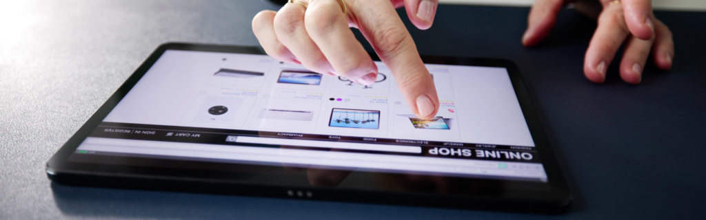
This is achieved through flexible grids, responsive images, and CSS media queries that adapt to the user’s device.
Opal Infotech is well-versed in building mobile-responsive websites using best practices like responsive typography, adaptive navigation, and image optimization. Our design strategies ensure that your website delivers an excellent mobile experience without compromising on aesthetics or performance.
What Our Customers Say
“We worked with Opal Infotech almost for one year for different projects like Magento website design and all related functional extensions and even different server management and so on…. We are really impressed with their jobs. Excellent knowledgeable support and live communication made Opal Infotech to be different than other software companies. We definitely recommend this company for any software development.”
– Alex Lahijani – Canada

FAQs:
Redesign Your Website for Multi-Device and Multi-Screen Experiences: Stay Ahead with Future-Ready Responsive Design
What is the difference between responsive and adaptive web design?
Responsive design uses flexible layouts and fluid grids to adjust automatically to different screen sizes. Adaptive design, on the other hand, uses distinct layouts tailored for specific screen sizes, providing a more customized experience for different devices.
How does mobile-first design improve my website?
Mobile-first design prioritizes the mobile experience, ensuring your website loads quickly, is easy to navigate, and is optimized for small screens. It results in a better user experience and improved performance across all devices.
Why are PWAs important for mobile websites?
<p><a href="https://www.opalinfotech.com/web-development/angularjs-development">PWAs provide a native app-like experience</a> directly on the web, offering features such as offline access, push notifications, and fast loading. They help improve user engagement without requiring app store downloads.</p>
Can Opal Infotech redesign my website for multiple platforms?
Yes, Opal Infotech specializes in multi-platform website design, ensuring your website works seamlessly across all devices, operating systems, and browsers.
How can multi-device optimization help improve my website’s SEO?
Mobile-first design and responsive web design enhance user experience, leading to lower bounce rates, better engagement, and improved rankings in search engines, particularly with Google’s mobile-first indexing.
Key Takeaways:
- Multi-device design is crucial for a seamless user experience across all platforms.
- Mobile-first and responsive web design strategies are key to staying competitive in today’s digital world.
- Cross-device optimization ensures consistency and functionality across devices and platforms.
- Progressive Web Apps (PWAs) enhance mobile experiences with offline access, push notifications, and fast load times.
- Partnering with Opal Infotech guarantees your website is optimized for the future of multi-device and multi-screen engagement.
About Opal Infotech: Mastery in Website Design Across Leading Platforms
Opal Infotech is a premier website design and development company renowned for its expertise in delivering dynamic and high-performing websites across multiple platforms. With years of experience and a team of skilled professionals, Opal Infotech has successfully catered to a wide range of industries, delivering exceptional digital experiences that not only look great but also drive results.
At Opal Infotech, we understand that each business is unique, and so are its web design needs. Whether you are looking to build a simple yet effective WordPress website Design, an e-commerce store using Shopify or WooCommerce, or a more complex solution with Angular, Laravel, or BigCommerce, we have the expertise and resources to bring your vision to life.
Our proficiency spans a variety of platforms, including:

WordPress: Perfect for creating easy-to-manage blogs, portfolios, and business websites. Our custom WordPress themes are responsive, SEO-friendly, and optimized for performance.

Angular: For businesses requiring advanced web applications with dynamic features. We specialize in building scalable, high-performance web apps using Angular’s cutting-edge technology.

Laravel: We provide tailored solutions for clients seeking robust back-end development, building secure and scalable web applications with Laravel.For more details,You can visit our Laravel Development services page.

Shopify & WooCommerce: As leaders in e-commerce, we create visually compelling online stores with seamless shopping experiences that help increase conversions and boost sales.You can learn about Shopify Web Design and WooCommerce Website Design Services, Then Visit our Website.

Wix: Perfect for those who need a quick and attractive website solution, we leverage Wix’s drag-and-drop features to deliver intuitive, modern websites.For more details about Wix website Design services, You can visit our page.

PrestaShop: Ideal for businesses looking for a comprehensive e-commerce platform with extensive customization options, we deliver powerful, customizable stores on PrestaShop.If you want to know more about PrestaShop Website Design Services, Then Visit Our Page.

BigCommerce: We build high-converting online stores that offer seamless integrations and scalability with BigCommerce, allowing businesses to manage products and sales with ease.For more details, You can visit our BigCommerce Maintenance Services page.
At Opal Infotech, we don’t just focus on building aesthetically pleasing websites; we design digital experiences that are user-centric, fast, and optimized for all devices. Our team works tirelessly to ensure that every website we create is not only visually stunning but also functional, secure, and future-proof.
Outstanding Customer Service & Support
What truly sets Opal Infotech apart from other web design companies is our unwavering commitment to providing exceptional customer service and ongoing support. We believe in building long-term relationships with our clients by offering personalized solutions and making sure they feel supported every step of the way.
- Quick Customer Support: Whether it’s a small query or an urgent technical issue, our team is always ready to assist you. We pride ourselves on providing responsive, friendly, and knowledgeable support, ensuring that any issue is resolved quickly.
- Post-Launch Assistance: After launching your website, we don’t leave you on your own. We offer continuous support to ensure your website stays updated, secure, and running smoothly. Whether it’s adding new features, updating content, or optimizing your website, we are here to help.
- Tailored Solutions: Every business is different, which is why we offer customized services that align with your unique goals. From planning and design to development and ongoing maintenance, we ensure that the final product meets your business objectives and exceeds your expectations.
Opal Infotech’s team is always committed to delivering high-quality websites and offering continuous support, ensuring that your digital presence stays relevant and functional in an ever-changing technological landscape.

With a digital legacy established in 1998, the editorial team at Opal Infotech combines decades of experience with cutting-edge innovation. As a premier Web Development and Digital Marketing agency, we specialize in crafting robust digital solutions – ranging from Custom Web Development and eCommerce platforms to Mobile Apps and Business Website Design. Today, Opal Infotech is at the forefront of the technological shift, helping businesses integrate AI SEO and AI Business Solutions alongside traditional powerhouses like Google Ads and Website Maintenance. Our goal is to translate complex tech trends into actionable growth strategies for global enterprises.
We publish articles to empower business owners with the clarity needed to make informed decisions in a complex digital landscape. Our technical content is designed to demystify high-level innovations like AI and SEO, translating code into actionable business growth strategies.