


















- How can mobile-first indexing improve user experience?
- How can mobile-first indexing improve your website’s visibility and attract more mobile traffic?
- How can mobile-first indexing lead to improved page speed and load times for mobile users?
- How can mobile-first indexing ensure that your website’s content is consistent across all devices?
- How can mobile-first indexing provide a competitive?
- How can mobile-first indexing help future-proof your website?
Also visit Our Page
Custom Web Design ServicesHow Mobile First Indexing Can Improve User Experience?
The shift to a smartphone-centric society means that more people than ever before are browsing on their smartphones. Google has recognized and is incorporating this into its search algorithm with mobile-first indexing.
How will this change affect my SEO?
In the past, Google analyzed the content of desktop sites to determine where they should be positioned in its search results. With mobile-first indexing, however, Google will now start with the mobile version of a website and rank that first.
How will this change affect responsive website?
Responsive websites are typically designed so that the desktop and mobile versions of a site have the same HTML code. This allows for a more seamless user experience between devices.
How will this change affect internal links?
One thing that many webmasters forget about is that Google needs to see the full set of internal links on each page. If you only have a few key internal links on your mobile version, that can impact how Google crawls and ranks your pages.
How will this change the way I use rel=canonical/switchboard tags?
If you’ve already implemented these tags, Google recommends that you continue using them. They say that the switch from old-style links to new-style ones won’t affect your rankings, but you should still be sure to maintain them on both the mobile and desktop versions of your site.
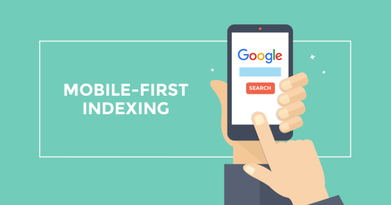
How Can I Make My Website More Visible and Attract More Mobile Traffic?
Mobile First Indexing and the Impact on Search Results
In an effort to respond to rapidly changing user behavior trends, Google introduced mobile first indexing. This change in their primary means of ranking and indexing content will favor websites that are optimized for mobile devices compared to desktop variants.
How Can I Make My Website More Visible and Attract More Mobile Traffic?
One of the most important things to do is to ensure that your website’s mobile version has the same content as its desktop counterpart. This includes everything from the meta robots tags to the structured data on your site.
The same goes for external links – don’t forget to consolidate them on your mobile pages.
You should also make sure that your site’s mobile and desktop pages share the same content, such as images, internal links, and other key resources. This will help you to avoid any potential rankings losses that may occur as a result of the mobile-first indexing update.
These design elements are a good idea for the mobile era because they reduce loading time and improve the user experience. However, these aren’t the only factors that affect your site’s search ranking. You’ll also need to take care of your mobile page speed and load times, as well as ensure that images are properly optimized for mobile use.
How Mobile First Indexing Can Lead to Improved Page Speed and Load Times for Mobile?
Google’s latest search algorithm update, the Page Experience Update and Core Web Vitals (CWV) updates, have reinforced how important it is that your website loads fast on mobile. Having a slow site is not only irritating to users, but it can negatively impact your conversions as well.
As a result, Google is now crawling and indexing content based on the mobile version of a site first and then using those results for both desktop and mobile SERPs. This change is a response to user behavioral trends, which show that people are increasingly using their mobile devices to browse the internet.
Having the same content on your mobile and desktop sites is one of the most important factors when it comes to mobile-first indexing. If you serve different content to your mobile site, it can negatively impact your rankings, and it may even cause a drop in traffic.
The most obvious way to ensure your mobile site has the same primary content as your desktop site is to use a responsive web design. However, it’s also essential to make sure that you are not purposefully serving less content on your mobile site than your desktop site.
Another key part of this is to ensure that all your structured data and other resources are mirrored on both your desktop and mobile sites. In addition, be sure to use the same meta robots tags and headings on both your desktop and mobile sites.
How Mobile First Indexing Can Ensure That Your Website’s Content is Consistent Across All Devices?
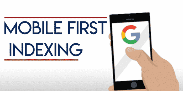
With Google’s recent switch to mobile-first indexing, it’s important to know how your website’s content will be affected. This can have an impact on your search results and traffic, so you must do your research and make sure your site is prepared for the change.
How to ensure your website’s content is consistent across all devices
As a rule of thumb, the primary version of your site should be used as the indexing source for most of the information on your site. This means that your primary content should be identical between desktop and mobile.
This is why it’s vital to use the same headings, paragraphs and text on each version of your site. You should also use the same meta tags, structured data, titles and descriptions, images, videos and links on both platforms.
Another common mistake is to remove content from your mobile page, which can negatively impact your site’s rankings and traffic. To avoid this, try to add more content to your mobile page and rework the layout of your website to make it mobile-friendly.
Using responsive designs to display your pages on different devices is the best way to ensure that you don’t lose any traffic in response to the mobile-first indexing update. However, don’t forget to check whether the content you add to your mobile site is relevant and useful for users. If it’s not, consider updating the content on your mobile site to match that on the desktop version.
Also visit Our Page
Digital Marketing ServicesHow Mobile First Indexing Can Provide a Competitive Edge?
The introduction of Google’s mobile-first index can provide a competitive edge to businesses who are prepared to take action. However, the shift presents a number of challenges for SEOs and website operators.
Firstly, it’s important to understand that mobile-first indexing is not a separate index; Google has only one index from which to serve search results. If your site has equivalent mobile and desktop content, this switch should have minimal impact on rankings.
Second, you need to make sure your site is fully optimized for mobile. This includes not only mobile-friendly design but also content, page speed, and responsiveness.
Third, you need to ensure that your site has both a desktop and a mobile version. This can be done through setting up and verifying both versions of your site in Google Search Console and ensuring that both have relevant content.
Fourth, you need to update your site with relevant and high-quality mobile content that is optimised for both users and Google. This can include adding videos, infographics, and images that are mobile-friendly and accessible.
Fifth, you need to ensure that your site is responsive across all devices. This can be achieved through using a responsive framework or a dedicated mobile website.
Sixth, you need to ensure that your site is fast – Google has confirmed that page speed is an important factor in mobile-first indexing, and this is a key consideration for businesses looking to get ahead of the curve.

How Mobile First Indexing Can Help Future Proof Your Website?
Google’s recent move to index and rank pages based on the mobile version of webpages is a major shift in its search engine optimization (SEO) process. This new method means that Google’s searchbot Smartphone agent will crawl and index a website’s mobile version of content, instead of the desktop version, in order to understand how relevant it is for a user’s search query.
What this means for SEOs and webmasters?
One of the most important things to know about mobile-first indexing is that it won’t impact rankings or traffic on a site that was already indexed by the desktop Googlebot. In fact, most websites should be ready to migrate over to mobile-first indexing and won’t experience any negative impact in the short term.
How to Find Out if Your Website Has Been Switched Over?
When a website is migrated over to mobile-first indexing, Google will send a message to the webmaster. This will notify them that their site has been re-indexed and the two versions of the page should be similar on desktop and mobile devices.
It is a good idea to check this message in Google Analytics to make sure you don’t see any decline in traffic from desktop. You can also add a note in your server logs to annotate the date you got this notification.
What to Do After Your Site Has Been Enabled?
Once you know your site has been migrated over to mobile-first indexing, it’s time to get started on optimizing for the change. This will involve ensuring that the primary content on your mobile site is equivalent to the desktop version, and examining issues like blocked resources and page speed optimization .

With a digital legacy established in 1998, the editorial team at Opal Infotech combines decades of experience with cutting-edge innovation. As a premier Web Development and Digital Marketing agency, we specialize in crafting robust digital solutions – ranging from Custom Web Development and eCommerce platforms to Mobile Apps and Business Website Design. Today, Opal Infotech is at the forefront of the technological shift, helping businesses integrate AI SEO and AI Business Solutions alongside traditional powerhouses like Google Ads and Website Maintenance. Our goal is to translate complex tech trends into actionable growth strategies for global enterprises.
We publish articles to empower business owners with the clarity needed to make informed decisions in a complex digital landscape. Our technical content is designed to demystify high-level innovations like AI and SEO, translating code into actionable business growth strategies.
